Meme Generator (PixPix)
Impact-style typography
Introduction
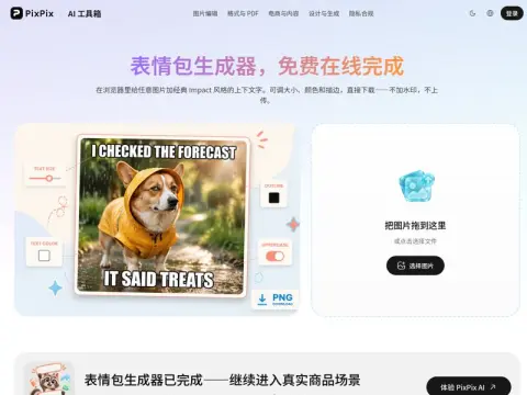
Many online sticker generators add their own domain names in the corner of the final product. In other words, when you create a sticker, they are essentially giving it free advertising—something that can even look awkward when shared in groups. However, with our service, there is no need for watermarks or accounts; what you get upon export is simply your own image with your text added, in high-quality format.
It features a classic Impact-style layout with text arranged in two rows. The font size, color, and border thickness can be adjusted, and the text can be switched between uppercase and lowercase. If the text is too long, it will automatically wrap and center itself without overflowing. This format has remained popular for over a decade, mainly because the white text with black borders ensures that the content remains clearly readable in thumbnail sizes of any size.
There is a clear division of responsibilities when it comes to composing text: the top line sets the context, while the bottom line introduces the turn or change in the narrative. If both lines contain complete sentences, the rhythm will become too slow. It’s best to try to fit everything within one line—otherwise, emoji packs that span multiple lines are rarely read through in a chat window.
Related